CSLU2850.Lo1 Web Project 12
Assigned: April 23
Due: April 30
In this project we will:
- work with processes;
- determine the Center Line for Control Charts;
- determine Control Limits for Control Charts;
- analyze the x-bar Charts;
Control Charts
Processes
A Process is any activity that takes a set of inputs and creates a product. Usually, we wish to
control the operation of the process in order to improve the quality of the product. The analysis of processes
is called Statistical Quality Control. The purpose of Statistical Quality Control is to reduce variations in the product.
There are two types of variations:
- Controlled Variation: Variation caused by the nature of the process. To correct this type of variation,
we must redesign our process in attempts of finding a set of better controlled variations.
- Uncontrolled Variation: Variation caused by a special case. To correct this type of variation, we
would address the special case.
Control Charts
A Control Chart is a graph of the values of a process plotted in time order. This chart will help us visualize
a process to inspect for variations in quality.
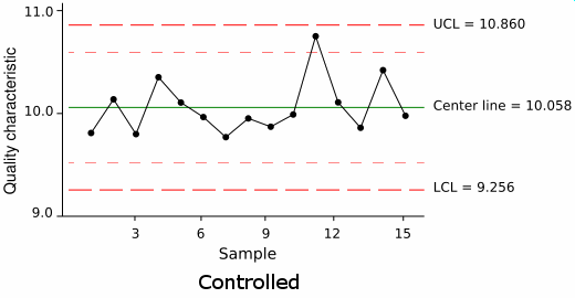
As you can see in the example above, there are three main components of a Control Chart:
- The Upper Control Limit;
- The Center Line;
- The Lower Control Limit;
The Center Line of a process indicates the expected values of that process. The Upper Control Limit and Lower Control Limit
act as a boundary for the process's variation. In most cases, as long as the process's values stay within
the Upper and Lower Control Limits, we assume that the observed variation is controlled variation, i.e. the process is in control.
A process is Out of Control if:
- one of the process's values crosses the Control Limits;
- there is a progession of the process's values towards one of the Control Limits;
- the data values cluster in a non-random fashion;
Subgroups
Subgroups are a convenient means of grouping individual observations together. The assumption is
that individual observations within a subgroup differ only by controlled variation. So, using subgroups to create a set
of observations for a process, implies that the set of observations is relatively stable with controlled variation.
Often, individual observations in a subgroup are taken at sequential time intervals.
x-bar Charts
An x-bar Chart is one of the most common control charts. Each point in the x-bar chart represents a subgroup average against
the subgroup number. Since the Central Limit Theorem states that the subgroup averages approximately follow the normal distribution,
we can calculate the upper and lower control lines the same as the standard deviation, when the standard deviation is known:

and

If μ is not known, then we can replace it with x-bar, the mean of all the subgroup averages.
Deliverable
Auto Correlation Function
- Import this Tab-delimited text file,
Silicon_Chip_Manufacturing.txt, into Excel. This file contains 100 subgroups, of 25 observations each. Each observation
measures the temperature of a chip. A chip's expected running temperature is 2.36 units. Each of the 25
observations in a subgroup were taken in a small time frame. [Note: This data set contains errors.]
- In step 1 of the Text Import Wizard Dialog, make sure to select Delimited.
- In step 2 of the Text Import Wizard Dialog, make sure to adjust the column separators, if Excel has made a mistake. If you miss this step,
then your Worksheet may have columns in the wrong place.
- Create an x-bar chart:
- Calculate the average of each sample set.
- Calculate the Center Line.
- Calculate the Upper Control Limit.
- Calculate the Lower Control Limit.
- Graph your results on a Scatter Plot.
- Is this process under control? Support your claim.
Make sure you have labeled your charts neatly and appropriately. Also, make sure all of your charts are visible
in your Workbook. Once you have completed all steps, save your Workbook as Project12.xls. You should email
your instructor this .xls file.